Bakery website case study: Thank You Sweets

Michelle from Thank You Sweets got in touch with me as she was looking to revamp the branding and logo of her baking business. Thank You Sweets provides all sorts of delicious treats but focuses mainly on cupcakes and small bakes for parties and celebrations.
Following early discussion with Michelle, and reviewing her existing branding and the answers to her design questionnaire, it became clear that she was looking for a much brighter and fresher look for her business. It was also important to inspire confidence in her customers as she was keen to convey that Thank You Sweets were a 'go-to' place for celebration sweet treats.

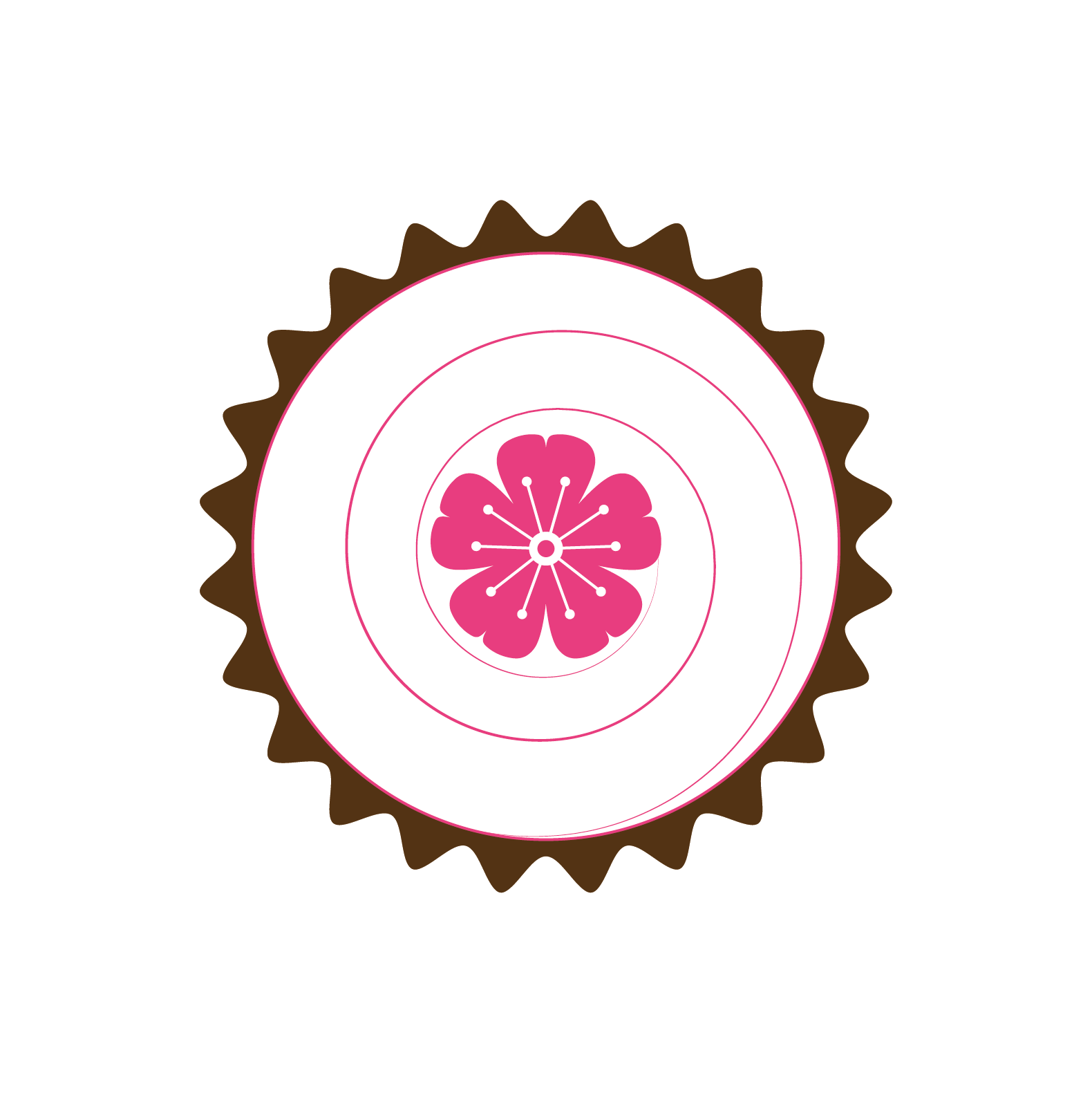

There was one element from the existing branding that Michelle really wanted to carry through to her new logo, which was the simple five petal flower that appeared in her old logo. It is used as a cupcake topper in her baking business and has become the recognisable mark of Thank You Sweets. It ended up playing a very big role in her new website and logo!
My first step, after gathering all of the information together, is to create a mood board (right). Here I started to build up a colour palette for the rebrand, which was a mix of pinks, teals, yellow and navy. Simple marks and bright pops of colour were the main these, along with beautifully showcased baked goods and minimal florals.

The next step is to put together three logo options for Michelle to review and comment on. Following some back and forth discussion we opted for the option using the three flowers and a mix of two fonts. Michelle loved the simplicity of this logo and it nicely represented her flower motif and here three daughters!


From here I refined the colour palette and created alternative and sub logos for use on the website and social media. For ease and to create a reference for the future, I assemble all of the brand elements on to one Style Sheet, which really helps moving forward with the website development.

With the majority of the branding work done I can now move on to creating the website on Squarespace. By this stage a lot of the design work has been done so I am able to focus on the layout and usability of the website.
Through the website development, it became clear that additional graphic elements would be required, for use on the homepage and, most importantly, for the menu pages. It was a mammoth effort, but I am so delighted with the way these pages have turned out, the cupcake toppers being my absolute favourite!

Michelle was a joy to work with and I just love the way this brand redesign has all come together.